Every week, I write a deep dive into some aspect of AI, startups, and teams. Enter your email address to subscribe below!
Slack is no place for the Great American Novel
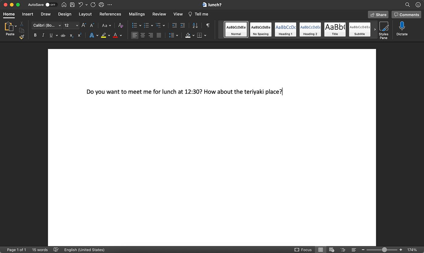
I kept marking the update as unread, setting reminder after reminder and snoozing them whenever the notifications popped up. More than a week went by. Several days too late, I did read it. Because the information in the update was critical, I instantly regretted that I hadn’t done it sooner. If you pay attention to what you read and write online, you'll see that it isn’t just one project update from one person in one tool. Illegibility is everywhere. The medium matters You don't publish an entire document to see if someone can meet you for lunch in an hour; you send them a text. You don’t try to get a code review by typing extensive code into a chat window; you use a code editor.
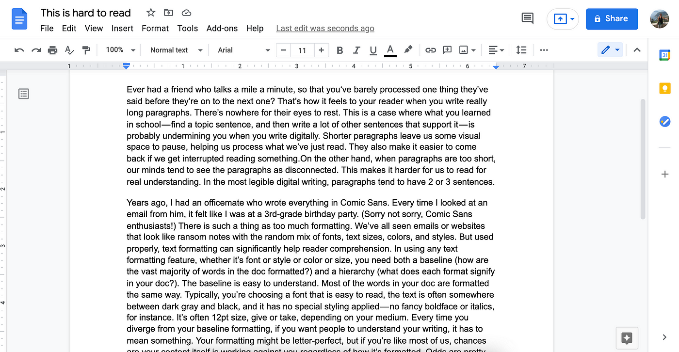
We type words in many different places over the course of a given day, and each place has a different purpose. One of the most fundamental mistakes people make when sharing written information is choosing the wrong medium to share it. Because each medium has built-in features or limitations that change how you’re able to represent what you’re writing. Writing something long? Use a word processor or text editor that’s designed for long documents, one that has paragraph spacing and font and text formatting choices built in by default. Text and chat apps (including Slack) are only good for short notes. The medium is the message. Use blank space thoughtfully Ever had a friend who talks a mile a minute, so that you‘ve barely processed one thing they’ve said before they’re on to the next one? That’s how it feels to your reader when you write really long paragraphs. There’s nowhere for their eyes to rest.
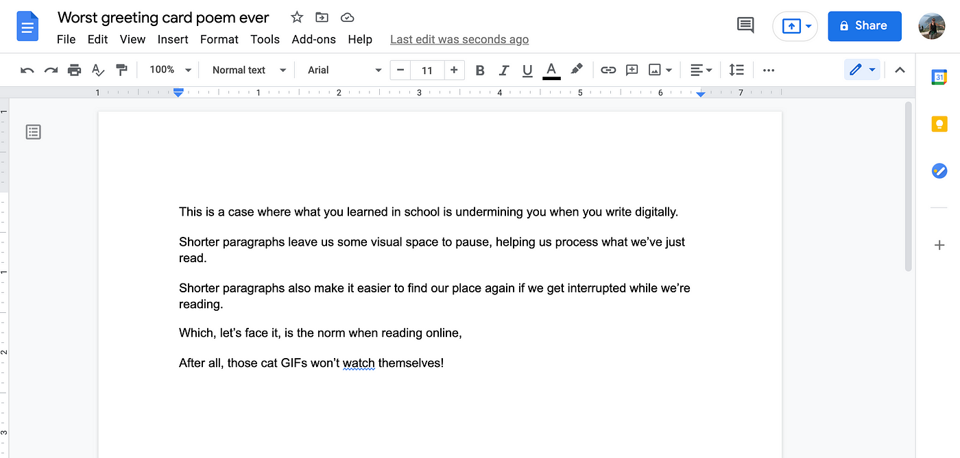
What you learned in school — find a topic sentence, and then write a lot of other sentences that support it — is undermining you. If you’re like most people, your paragraphs are about twice as long as they should be for digital readability. Shorter paragraphs leave us visual space to pause, helping us process what we’ve just read. Shorter paragraphs also make it easier to find our place again if we get interrupted while we’re reading. Which, let’s face it, is the norm when reading online; after all, that hilarious cat GIF you just texted me won’t watch itself!
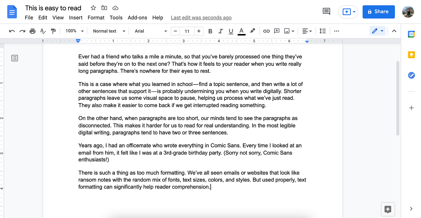
On the other hand, when paragraphs are too short, our minds tend to see the paragraphs as disconnected. This makes it harder for us to read for understanding, causing even the most thoughtful prose to read like an avant-garde poem. In legible writing, paragraphs usually have two or three sentences.
Text formatting: Your best friend or your worst enemy Years ago, I had an officemate who wrote everything in Comic Sans. Every time I looked at an email from him, it felt like I was reading a garage sale flyer. I definitely wasn’t buying what he was selling. Sorry not sorry, Comic Sans enthusiasts. As my officemate demonstrated every time he typed, unconventional font choices are risky. And there is definitely such a thing as too much formatting. We’ve all seen websites that look like ransom notes with their random mix of fonts, text sizes, colors, and styles. But used properly, text formatting can significantly improve reader comprehension. The exact same words become a lot more understandable when you organize and format them for legibility.
In using any text formatting feature, whether it’s font or style or color or size, you need both a baseline (how are the vast majority of words in the document formatted?) and a hierarchy (what does each formatting choice signify in your document?). The baseline is easy to understand. The majority of the words in your doc are formatted the same way. You choose a font that is easy to read, the text is often somewhere between dark gray and black, and it doesn't use boldface, italics, or other fancy styling. It might be 11 or 12pt size, give or take, depending on your medium. Good writing software does its best to help you out with baseline text formatting. Unless you’re unusually design-minded, it’s a good idea to stick with the software’s default. Some writing software doesn’t even let you change the default, because if you could, you might end up choosing Comic Sans. But sometimes you need to highlight a piece of text so that it stands out from the baseline. If you don’t want your document to end up looking like an internet ransom note, proceed with caution. Every time you diverge from your baseline formatting, for people to be able to successfully parse your writing, the divergence has to mean something intentional. That means that if you’re using 14pt bold for one section heading, then every similar section heading in the document has to use 14pt bold. If you’ve decided that all dates in your document should show up purple, then you can’t use purple to highlight someone’s name as well. Stay consistent so that your reader can follow along. Clean formatting can't save terrible writing Your formatting might be letter-perfect, but odds are good you’re writing more words than you need to. If you are, formatting can't save you. Every time I write any substantial business communication, I write my first draft without too much self-consciousness about content or formatting. The important thing at that stage is just to get my thoughts down on paper. Then I go through the draft again, playing a game I like to call “Can I Make This Half as Long?” Sometimes it makes me sad relegating all those words to the trash bin. But if I can truly remove half the text from a long document, the final draft is always clearer. Because the truth is, formatting tricks can only take you so far. At some point, the content itself has to be good too. What do you think? Thanks for reading! Kieran Catch up on nerd processor case studies | Subscribe | nerdprocessor.com
|
|
nerd processor
Every week, I write a deep dive into some aspect of AI, startups, and teams. Enter your email address to subscribe below!
Buying robots from robots Last week I received the following obviously-ChatGPT-generated sales mail in my Textio inbox: What is the product? Who knows! As I've written recently, I'm currently receiving hundreds of identical-sounding sales mails every single week, most obviously written with ChatGPT or with tools that wrap ChatGPT pretty thinly. The majority of these messages are offering AI-powered sales and marketing tools. Oh, the irony. Here's what I'm wondering: Is anyone reading this...
Selling AI sure is fun! Recently, I had a conversation with the founder of an AI startup who described an interesting dynamic: CEO of a traditional enterprise announces that every department should be modernizing operations with AI Every team rushes to investigate, including teams with limited tech expertise (think HR, finance, marketing, legal) Suddenly everyone wants to buy stuff, per the CEO mandate, so IT scrambles to assemble an AI review board, usually without experienced personnel...
Surveying VCs for Kamala Harris Two weeks ago, Leslie Feinzaig, Founder and General Partner at Graham & Walker, approached me about running a survey for signatories of the VCs for Kamala Harris pledge. As Leslie led the effort to get investors engaged with the pledge, she saw that signatories included numerous Republicans and Independents as well as the Democrats you might expect. In order to accurately represent their perspective, she wanted an independent view into what this politically...